top of page
Search

REGEXPLORE is a reporting tool developed for domain registries / TLD operators. The tool provides a series of dashboards and reports on the status and trends in registrations both at registrar and registry level.

Who is it for?

The has been developed for top level domain operators that have a channel of domain registrars (however could be used for any organisation that manages a subscription based product and works with resellers).

How does it work?

Users upload aggregated registration data (either manually or can be scripted) to the platform. This is generally done on a monthly basis. Data is used to populate a series interactive dashboards, trend charts, performance ratios, bench-marking, alerts and other analysis which help the user to better understand the status and trend of its business and individual sales partners.


The tool is embedded within a secure platform (regexplore.com) which contains itneractive dashboards and tables. A static report on the key activity is also sent by email to the users.

What's included?

The platform is broken down into interactive dashboards pages around the following areas

  • Registration activity: Performance ratios and related metrics, trend charts, analysis of inter-channel transfers, alerts (irregular activity) and more

  • Registrar profiles: Performance ratios, growth drivers, trend charts and transfers (eg largest wins/losses)

  • Market shares: Calculated on country (if relevant) or individual organisation.

  • Benchmarking tools: Trend analysis, scatter plots, ranking etc.

  • Optional extras / add-ons

    • Geographic maps: Postcode level data on customers and growth areas

    • Retail prices: Data collected from public reseller websites on retail prices


Find out more

To find out about Regexplore or or sign up: contact us


Screen shots (sample data) from the data platform


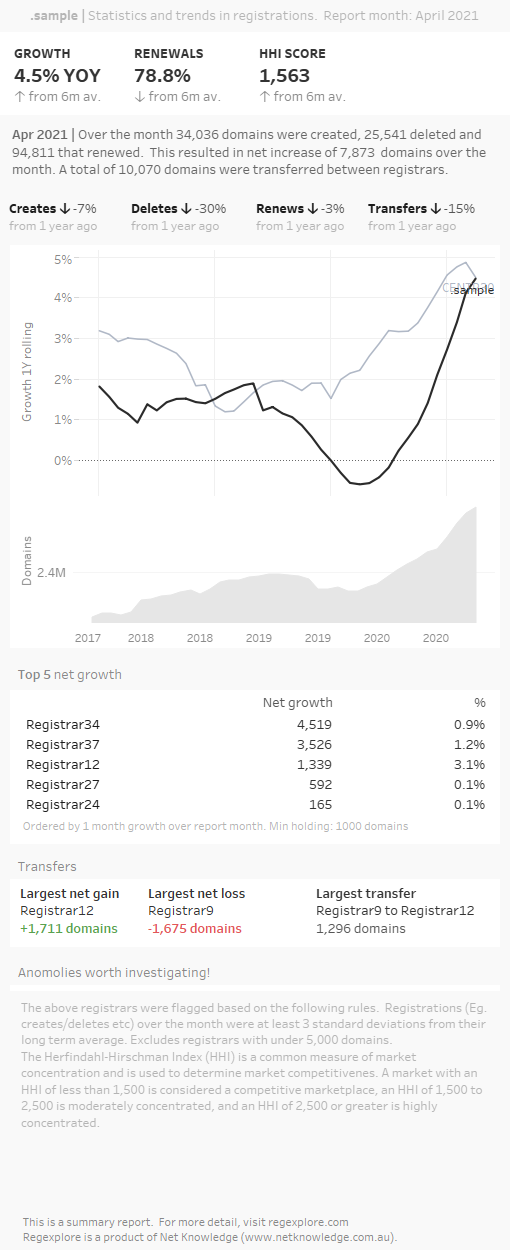
Example of monthly email report


We've put together a useful map showing most bulk billing doctors in and around Melbourne Victoria. The map uses google maps and so has all the features that that comes with (zoom, search). If you happen to know of a bulk billing doctor not included in this map, please get in touch and we'll update it!

Click through to live map

Choosing the right tools for the right job

Choosing the right tool for data visualisation is important, particularly when it comes to maps. Some tools just do it better. In the case of a map with specific latitude and longitude locations, we've put aside regular tool of choice, Tableau and instead opted for Google Maps which provide a lightweight and clean map.

Other factors to consider when choosing the right data visualisation tool might relate to the cost of the tool, the options in charts, where the visualisation will be published and more.

How we can help your organisation

Net Knowledge is a data visualisation and analytics agency in Melbourne specialised in interactive dashboards and maps. We are specialists in Tableau software.

Net Knowledge helps organisations by designing and maintaining data dashboards for management and staff to understand their market or business. Our clients are industry and membership associations as well as mid size companies where we help with everything from simple survey data analysis to development of complex data platforms with hundreds of users.

Get in touch to find out how we can help

28% of all Victorians were born overseas as reported at the Australian Bureau of Statistics in 2016 (data released in 2017), an increase on 26% reported in the previous 2011 census. And so, it is interesting to see where these new Victorians are coming from.

This interactive shows the total number of people by postal areas* in Victoria that were born in countries other than Australia. Victorians come from over 200 different countries– however note that the top 35 countries (representing the most data in terms of significant population) are included in this visualisation.

In this chloropleth map – postal area (POA) defined regions are colour-coded by the population of persons by country of birth selection in that region, showing the distribution of countries by birth across the state. The colour of the postcode reflects the largest group within that postcode (hover over to view the top 5).

Note that the postal areas (POAs) are an approximation of postcodes in this representation and is a slightly different data structure used by the ABS from the previous 2011 census data. Previously, Statistical Areas Level 1 (SA1s) were used where geographic regions across the nation are defined as areas having populations between 200 to 800 people. A more detailed explanation on this methodology is provided here. (this can be footnote in blog)

Summary findings

The largest number of people who immigrated to Victoria come from the British Isles – which is also the same across Australia. Overall in Australia, the top five nations of immigration are the UK, NZ, China, India and the Phillipines.

Immigrants from the UK and China are heading out southeast (with their largest new populations represented in Botanic Ridge and Brandon Park respectively), whilst those from NZ, India and the Phillipines are moving out west – (Hoppers Crossing and Burnside).

Bangholme (POA 3175), located 31 km south-east from the centre of Melbourne, had the highest number of people born elsewhere (10430), reflecting the growing population moving to the fringe regions of Greater Melbourne.

The Philippines immigrant population is clustered around Hoppers Crossing, Burnside and Cororoc (all next to each other) whilst the other communities are more dispersed throughout Melbourne and Victoria – with large relative populations on both sides of Port Phillip Bay.

Victoria has four of Australia’s top five fastest growing suburbs – South Morang, Cranbourne East, Craigieburn-Mickleham and Point Cook, which also have marked immigration populations seen by selecting the ‘Born Elsewhere’ filter in the chart.

The second chart here shows the distribution of countries (from the 35 countries represented in the data) that people have come from as a proportion of the total population of each POA. Type in the Postcode/POA of your suburb of interest to see populations of people who have immigrated here, and where they came from.

Click through to interactive version

Within central Melbourne (POA 3000) the top 5 countries of immigrants come from China, Malaysia, India, Indonesia and Korea, which differs vastly from the state average, and the national average where Britain and New Zealand feature in the top 2.

1
2
bottom of page